
Lesson 4 of my online sketch and watercolor class covered flowers. I knew not to use a rose, as they are just problematic for beginners. I went to the only two stores in my area that sold flowers. Other than roses and orchids, there wasn’t much of a selection. I ended up with brightly dyed flowers.
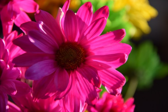
Too pink?
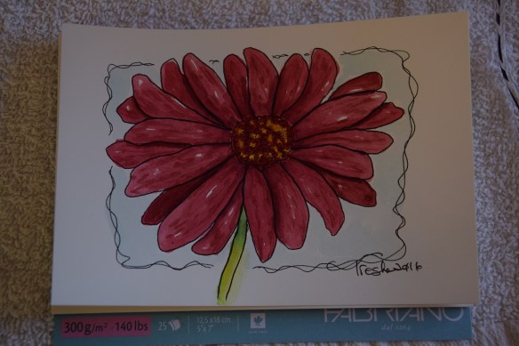
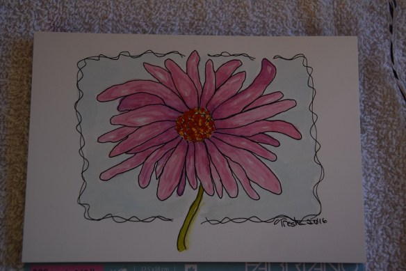
The flower isn’t particularly recognizable from my paintings. I’m calling that “an artist’s interpretation.” That’s my story and I’m sticking to it.
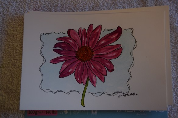
First try: Too monochromatic
Second try: Petals too uniform
Third try: Color too light
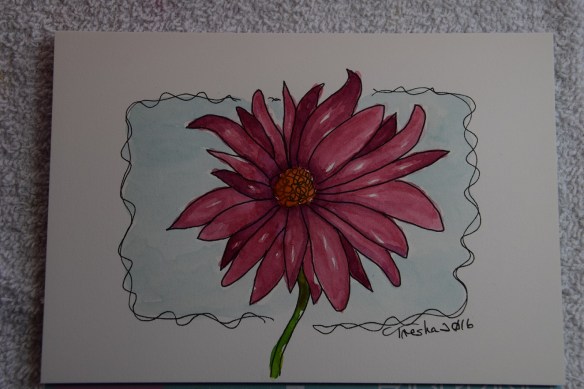
Fourth try: Too tired to do another one. This is the one I posted to my online class as my homework assignment.

Well I think all four of your flowers are pretty, though the original source may be just a bit too pink for my tastes;) I like the color of the one you submitted the best
Thanks! I’m putting this lesson on my re-do list, when I can find better flowers to sketch.
Yes, #4 has depth and even attitude! Too many people do it once and think, “Well, that’s good enough.”